.svg)
.svg)
.svg)
Branding for: ScrapeData SaaS Product
Building a brand base for production-grade web data infrastructure
ScrapeData is a web data collection platform built for teams that need to extract public web data at scale without maintaining their own scraping infrastructure — covering acquisition logic, reliability, monitoring, and operational stability.
Translating technical strength into brand trust
.svg)
ScrapeData already had a technically strong product, but the brand did not reflect the maturity, reliability, and operational depth of the platform. The challenge was to create a visual system that felt calm, precise, and infrastructure-grade without relying on hype-driven SaaS aesthetics."
Turning fragmented perception into a scalable brand system
We translated ScrapeData’s technical depth into a clear and disciplined visual identity replacing inconsistency, weak positioning, and low brand clarity with a structured Brand Base built for trust, scalability, and long-term recognition.
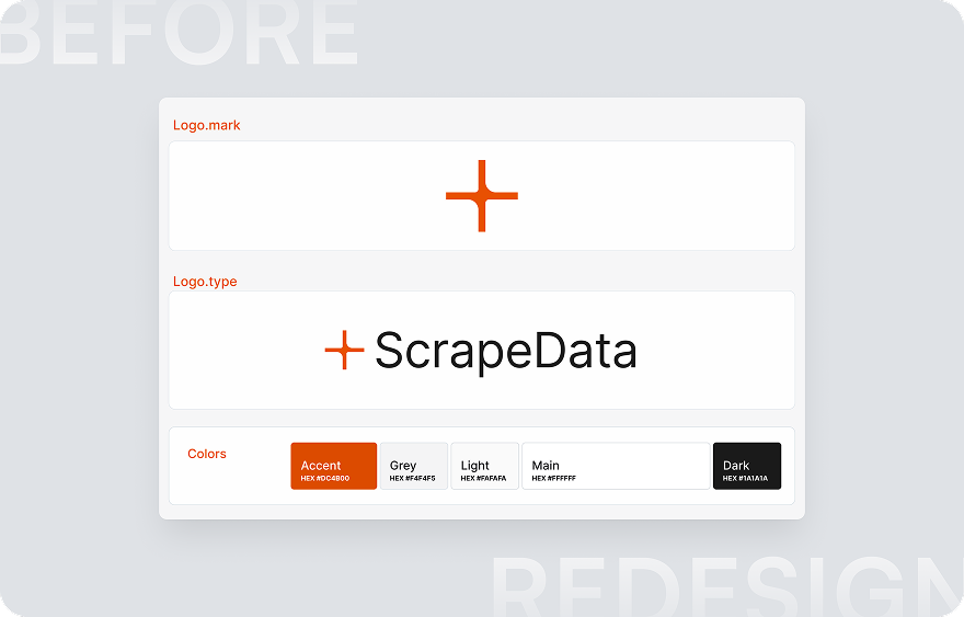
Before: inconsistent visual identity with no clear positioning or scalable system.
After: a disciplined brand identity logo, color palette and visual language built for an infrastructure-grade product.
.png)
.png)
Not ready to book a call yet?
Take a quick tour of how we work, what to expect, and how UXRS can support your product before starting a project.
Building the Brand Foundation
From strategy and brand positioning to visual identity and design guidelines every step was built to create a consistent, production-grade brand system for ScrapeData.

We started with a branding brief to define what ScrapeData stands for: its values, target audience, positioning, and the kind of trust it needs to earn from technical teams. In parallel, we mapped the competitor landscape studying how similar infrastructure and data platforms present themselves visually, where they converge, and where the field is underdifferentiated. That gap analysis shaped the direction before any visual work began.
Before sketching anything, we worked with metaphors. The goal was to find a visual language that could carry the core idea of the product structured data extraction, reliability at scale, and precision without noise without falling back on generic tech iconography. We explored forms, symbols, and conceptual directions: what the act of capturing and structuring data could look like when translated into a mark. This stage produced the conceptual vocabulary that fed directly into the logo development.
.png)
This stage focuses on developing the selected visual direction and building the core brand identity elements.
We refine the logo concept, explore visual directions with color palettes and symbols, and develop supporting elements such as patterns and logo states.
.png)
Two refined logo directions were developed for the client to evaluate, compare, and select the strongest foundation for ScrapeData’s final visual identity.
.png)
Brand Finalization
- Logo creation process
- Logo versions for different backgrounds and usage context. Adaptations for light and dark mode interfaces
- Development of key visual assets and marketing materials
ScrapeData already had a technically strong product, but the brand did not reflect the maturity, reliability, and operational depth of the platform. The challenge was to create a visual system that felt calm, precise, and infrastructure-grade without relying on hype-driven SaaS aesthetics."
.png)
Start a conversation
Tell us about your product or challenge and we’ll help you move it forward.
Other ways to connect
You can also connect with our team through social platforms and follow our latest design work and updates.
.svg)
.svg)